
The ecommerce product page checklist
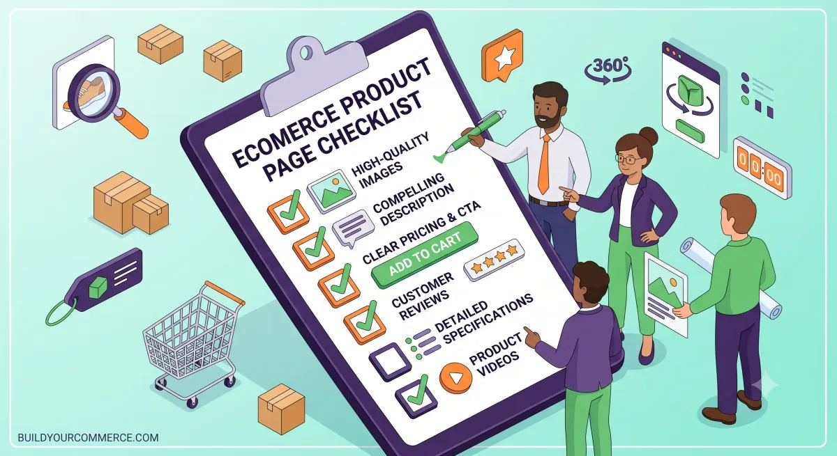
A product page converts when it answers every question a customer would otherwise leave to find: what it is, what it costs delivered, when it arrives, what happens if it is wrong, and how it differs from the variant beside it. Most product pages fail on missing information rather than on layout or visual design.
Product pages carry more revenue than any other template on a store, and receive less attention than the home page. This is the checklist we work through on every audit.
Before you change anything: record four numbers
A redesign that cannot be measured is a redecoration. Before touching a page, record:
- Conversion rate by device. Mobile and desktop separately, always. They behave differently enough that a blended figure hides the problem.
- Add-to-cart rate. Distinguishes “they did not want it” from “they wanted it and checkout lost them”.
- Checkout completion rate. The proportion who begin checkout and finish.
- The funnel drop-off point. Where in the sequence people actually leave.
Without these you cannot distinguish improvement from seasonality, and the conversation after launch becomes an argument about taste.
Is your product page actually the problem?
Worth checking before spending a budget. If paid traffic converts at a fraction of organic, the storefront is probably fine and the targeting is not. If mobile converts far below desktop, look at performance before layout.
We would rather tell you this at audit stage than three months into a redesign.
The checklist
Information — the section that matters most
- Is the delivered price clear, including delivery, before checkout?
- Is delivery timing stated on the page, not only in the footer?
- Are returns terms visible near the buy button, not buried in a policy page?
- Is it clear what is physically included?
- For anything sized: is there a sizing guide, and does it open without leaving the page?
- Are materials, dimensions or specifications present for products where they decide the purchase?
- Is it clear how this variant differs from the one beside it?
This section fails more often than all the others combined. Customers abandon because a question went unanswered, and adding the answer near the buy button reliably outperforms rearranging the page.
The cheapest conversion work on most product pages is writing, not designing.
Imagery
- Does at least one image communicate scale?
- Can images be zoomed without breaking layout?
- Is there an image showing the product in use or in context?
- Do images have explicit
widthandheightso the page does not shift as they load? - Is the primary image served in a modern format at an appropriate size?
The buy action
- Is the buy button reachable without hunting on a phone?
- Is variant selection obvious, and does it make out-of-stock combinations clear before selection rather than after?
- Does the page communicate stock status honestly?
- Are payment methods, including any buy-now-pay-later options, visible before checkout?
- Is there a clear route back to browsing that does not lose the cart?
Trust
- Are reviews genuine and numerous enough to be credible?
- Is there a visible contact route for pre-purchase questions?
- Are guarantees or warranties stated where they apply?
- Is the returns process described, not merely linked?
Technical and accessibility
- Every interactive target at least 44×44 CSS pixels
- Contrast meets WCAG 2.2 AA throughout
- Visible focus state on every control
- Interaction responsiveness stays comfortable during variant selection
- Structured data present and matching what is rendered
- Page usable at 200% zoom without content loss
Category-specific requirements
The checklist above is universal. These are the additions that matter by category, because a customer buying a jacket asks different questions from one buying a replacement part.
Apparel and footwear. Sizing guide with actual measurements, not just size labels. Model height and worn size. Fabric composition. Care instructions. Fit description — does it run small? Returns terms stated prominently, because return rates in this category are structurally high and customers know it.
Furniture and homeware. Dimensions with a scale reference. Assembly requirements and time. Delivery method — kerbside or room of choice materially changes the purchase. Weight, where it affects handling. Material detail beyond the marketing name.
Electronics and technical products. Full specifications in a structured table rather than prose. Compatibility, stated explicitly. What is in the box, itemised. Warranty terms. Firmware or software requirements.
Food, drink and supplements. Ingredients and allergens, prominently. Nutritional information. Storage and shelf life. Any regulated claims handled carefully — this category has real legal exposure and is not a place for generated copy without qualified review.
Made-to-order and personalised. Lead time stated before the buy button, not in a policy page. What can and cannot be changed after ordering. Whether returns apply at all, since personalised goods often fall outside standard cancellation rights.
Replacement parts and consumables. Compatibility is the entire purchase decision. A fitment lookup, or at minimum an explicit compatibility list, matters more than photography.
How to prioritise what the audit finds
An audit typically produces thirty to sixty findings. Shipping all of them is neither possible nor sensible, so they need ordering.
We score each finding on two axes.
Expected impact — how much of the funnel does this touch, and how strong is the evidence that it matters? A missing delivery estimate on every product page scores high. A slightly cramped related-products row scores low.
Implementation effort — content change, template change, or architectural change. Content changes are usually hours; architectural changes are weeks.
That produces four groups:
| Low effort | High effort | |
|---|---|---|
| High impact | Do first | Plan properly |
| Low impact | Do while you are in there | Do not do |
The top-left group is where most of the available gain sits, and it is nearly always writing rather than designing — adding delivery timing, stating returns terms, answering the questions support gets asked daily.
The bottom-right group is worth naming explicitly in any audit report, because it stops the same low-value ideas being raised repeatedly.
Measuring afterwards
Compare the same four numbers from the top of this article, over a full traffic cycle rather than a week. A week of data on a store with weekly seasonality tells you about the day of the week.
Three things to be careful of:
Seasonality. Comparing December to January will mislead you regardless of what you changed.
Simultaneous changes. If a redesign ships alongside a campaign, you cannot attribute the result to either. Stagger where you can.
Regression to the mean. If you changed something because a metric was unusually bad, some of the improvement would have happened anyway.
None of this means measurement is futile. It means the honest report says “conversion improved by X, and here is what else changed in the same period” rather than claiming clean causation.
On A/B testing, honestly
Most stores do not have the traffic for statistically meaningful A/B tests on anything except checkout. Testing a product-page variant at two hundred sessions a week produces noise, not evidence, and treating that noise as a result is worse than not testing.
We say which changes we can genuinely test and which are judgement calls informed by established research. Anyone promising rigorous testing on low-traffic product pages is selling certainty they cannot deliver.
What to fix first
If you can only do three things:
- Put delivery cost and timing on the page. Unexpected shipping cost is the most common abandonment cause in every study of the subject.
- Answer the top three pre-purchase questions your support team receives, in text, near the buy button.
- Make the buy button reachable on mobile without scrolling back up.
None of those require a redesign. All of them are usually cheaper than one.
A worked example
A product page we audited recently, anonymised. A mid-priced consumer product, healthy traffic, conversion well below what the category would suggest.
What the page had: eight studio photographs on white, a well-written brand story, a price, a buy button, and a related-products carousel.
What it did not answer: how much delivery cost. When it would arrive. What the returns terms were. What was physically in the box. How the two colour variants differed beyond colour. What the product’s dimensions were.
The design was genuinely good. The photography was expensive. And a customer could not work out what it would cost delivered, or what would happen if it was wrong.
What we changed first: added delivery cost and estimated arrival above the buy button; added a two-line returns summary beside it; itemised box contents; added one photograph with a scale reference.
None of that was design work. It was four pieces of writing and one photograph. It is the pattern we see repeatedly — the page looked finished and was not informationally complete, and those are different things that get conflated.
Where the checklist comes from
Nothing above is novel. It comes from three sources, and it is worth naming them so you can go deeper than this article.
Published ecommerce UX research, particularly Baymard Institute, which has run large-scale usability testing across ecommerce interfaces for years. Their findings on checkout and product pages are the closest thing the field has to an evidence base.
Accessibility standards. A surprising amount of good ecommerce UX is simply WCAG 2.2 applied properly — adequate target sizes, visible focus, sufficient contrast, no information conveyed by colour alone. Building accessibly produces better product pages for everyone, not only for people using assistive technology.
Support tickets. The cheapest research available and the most ignored. The questions your support team answers repeatedly are, by definition, questions your product pages are failing to answer. Reading a month of tickets will tell you more about your product pages than any audit.
That third source deserves emphasis. If you do nothing else from this article, ask whoever handles customer enquiries for the five questions they answer most often, and put those answers on the page.
What we would not bother with
Worth stating, because audit reports tend to list everything and prioritise nothing.
Exit-intent popups on product pages. They interrupt at the moment of consideration and the recovered conversions rarely justify the annoyance or the script weight.
Countdown timers on evergreen products. Customers recognise them, and a timer that resets on refresh damages trust more than urgency helps.
Live visitor counters. Same reasoning. If the number is real it is usually unimpressive; if it is fabricated it is dishonest.
Extensive related-product carousels. They push the information customers actually need further down the page, and carousels perform poorly for both engagement and layout stability.
Video autoplay. Weight, distraction, and an accessibility problem for no measured conversion benefit.
Every one of these is regularly proposed and every one costs more than it returns on a typical store.
Running the checklist yourself
You do not need an agency for the first pass. Open your best-selling product page on a phone, and work through the Information section at the top of this article as a customer who has never seen your brand.
Note every question you cannot answer from the page alone. That list is your work queue, ordered roughly by how early in the page the gap appears.
Most stores find between five and fifteen items on that first pass, and most of them are writing rather than design. That is a good afternoon’s work with a real return, and it costs nothing but attention.
A closing note on priorities
If there is one bias worth correcting on product pages, it is the assumption that visual quality and informational completeness are the same thing. They are not, and stores routinely have the first without the second.
Answer the questions first. Then make it beautiful.

