
Case study · Shopify · Redesign
Macian Collection
Macian Collection sells women's footwear handcrafted in England, sold through an editorial storefront where photography leads and the purchase is considered. We refined and modernised the existing store while preserving the brand identity, working on visual experience, product discovery, mobile usability and conversion.
| Platform | Engagement | Industry | Region | Live site |
|---|---|---|---|---|
| Shopify | Redesign | Luxury footwear | United Kingdom | maciancollection.com |
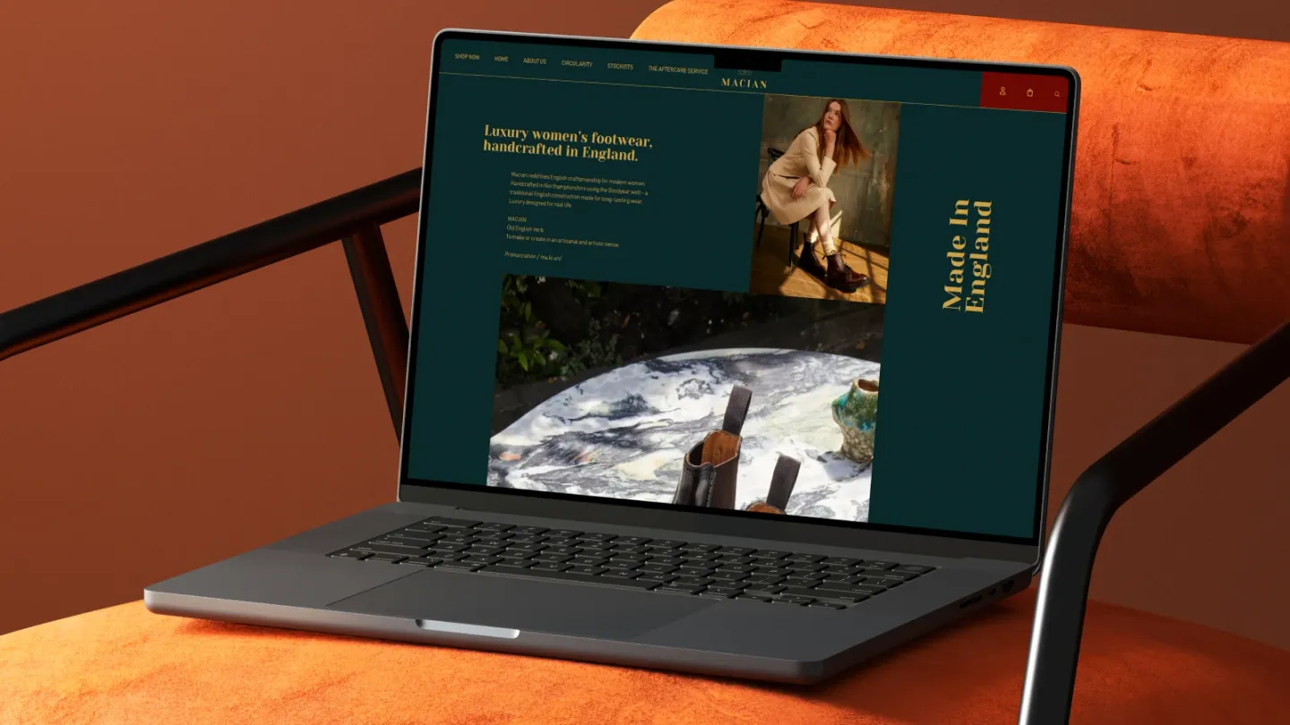
The storefront
The Macian Collection store as it runs today, at maciancollection.com. Screens change; this page describes the build rather than the current merchandising.
Open live siteThe challenge
Handcrafted footwear at luxury price points is not an impulse purchase. The store's job is not to close a sale on the first visit; it is to hold interest across repeat visits and hand over cleanly to a stockist or a fitting.
That inverts the usual conversion brief, and it means the ordinary levers — urgency, discounting, a faster path to checkout — are either useless or actively damaging to a brand built on restraint.
The approach
We refined the store rather than rebuilding it, and the brand's established identity was treated as a constraint to work inside rather than something to revisit. The art direction was already theirs.
Our work went into the parts that decide whether that art direction survives contact with a real shopper: product discovery across a range where the differences are subtle, mobile usability on an image-heavy storefront, the conversion paths that carry someone from an editorial page to a product, and storefront performance under the weight of the photography the brand depends on. Development and maintenance support continue alongside.
What we did on this engagement
What the build carries
Three structural decisions do most of the work in this store. Each one is a constraint the design had to satisfy rather than a feature added at the end.
Shopify
The existing platform. The engagement improved the storefront rather than migrating it.
Editorial page templates
Image-led layouts where photography carries the brand and the performance budget at the same time.
Aftercare and circularity pages
Repair and longevity content that supports a considered purchase rather than pushing one.
Notes from the build
Refined, not rebuilt
The store and the brand identity both existed before this engagement. Preserving that identity was part of the brief, which makes this a different kind of design job: the constraint is not a blank page but someone else’s art direction, and the work is to make it survive product discovery, a phone screen and a checkout.
What is the client’s
The photography, the brand language and the positioning are the client’s own. The Circularity and Aftercare pages describe repair and longevity — a durability position rather than an environmental claim, and it is described here as what it is.
No figure on this page is presented as an outcome of our work. The engagement, scope and services listed above are the claims that are ours.
Questions this build answers
Three questions this project raised about building on Shopify, answered in the terms the work actually set.
How do you design for a considered purchase rather than an impulse one?
You stop optimising for the first session. A shopper spending several hundred pounds on footwear will visit more than once, often on different devices, and may finish in person at a stockist. The design job is to make returning easy and to leave the reader better informed each time, rather than to compress the decision into a single visit.
What does an aftercare or repair service need from the website?
It needs to be findable before purchase, not only after. Repair and aftercare are part of the case for buying something expensive in the first place, so burying them in a post-purchase help section wastes their commercial value. They belong where someone is still deciding.
How do you keep an image-heavy storefront fast?
By deciding early what the photography is for. Editorial images earn their weight where they carry the brand and cost too much everywhere else. Explicit dimensions, modern formats and lazy loading below the fold handle the mechanics, but the real saving comes from using fewer, better images.
The services behind this build
Building something like Macian Collection?
Whether it is a new store or one that already exists and needs work, the first conversation is about scope rather than a pitch.
We reply within one business day